The Telegraph (Graphiti),
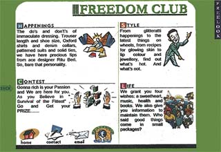
LOOKS MATTER To emphasise its brand identily, the site on the Freelook range of casual wear (freelookindia.com) used features such as ‘shock waves’ animation, a peppy soundtrack and jazzy colours to make the screen come alive visually.
 The Internet seems to have all the answers today. Whether it is establishing business contacts buying books or paintings, looking for a life partner or simply listing information regarding your work, all before you know it , your prayers will be answered. But remember, just having a website is not enough. If it is a dull and drab site that simply lists information, it is unlikely to enthuse the Net surfer to stop by and take a look. But a site that is designed creatively, is user-friendly and informative, is bound to attract many hits. There are certain salient features that go into designing a site. Among these is having a visually attractive site that is not too heavy on words and yet gives a lot of information. This can be achieved by using highlighters ans 3-D effects, that help make the screen look less static. Another must in designing a site is to ensure that one is able to access all the information one needs, with the least number of clicks. The home page of any website is the main introduction to the site and hence needs to be the most inviting and creative page. Also, it has to be packed with as much information in as clutter-free a manner as possible.
Gaurav Bhatia, a website designer with Intermesh Systems, says this can be done by adding visually attractive highlights and animations, panel strips and flash strips running across the page. He gives the instance of a site for the Freelook (log on to freelookindia.com) range of causal wear. The company wanted an emphasis on its brand entity. “So we used a lot of features such as ‘shock waves’ animation, a peppy soundtrack and jazzy colours to make the screen come alive visually,” Bhatia says.A popular Western number; Mambo No. 5 plays as one logs into the home page that has been done up in shades of bright orange and blue. The pages have a range of things to offer to the visitors. There are contests on ‘What is in and What is out’ in food, fashion and fun, as well as a veritable catalogue of causal wear. “We tried doing this one in a different way. For instance a page on the Freelook range of shirts, shows a variety of shirts – checks, stripes, plain and printed,” says Bhatia. As the opens up showing details of how different colours would look on that design. Similarly, for a site for a bridalwear shop (log on to sahilindia.com), he designed a captivating home page that shows a bride flanked by two men holding mashaals (torches) in their hands. The flame of the mashaal is animated, so one can actually see the moving flames. The following pages have equally inviting pictures that show models in a range of bridal outfits…
…Amit Gundh also of Intermesh Systems, a major web developing and designing company, feels that a website should be so designed that a person is able to track down the information he wants in the least possible time. “No person surfing the Net has the time to wait for several minutes for a page to appear. The pages then, should not be loaded with too many photographs or graphics, as it takes longer to download such a page,” he says…